Andrew Hick
Accessibility and test person
I help technology work for everyone. I'm a certified senior accessibility specialist, working at the UK Government Digital Service, to monitor public sector websites and apps for accessibility. I live in Bath, work in Bristol and go by he/him.
This site includes my professional work, hobbies and the bits in between. All opinions are my own, and everything on this website is designed by a human unless stated 🧠
Recent work
WCAG metro map
2026 updates so far:
- Czech translation added!
- Slovak translation added!
- Indonesian translation added!
- Ukrainian translation added!
- Brazilian Portuguese translation added!
- The map is now in vector format (making it appear crisp at any resolution)
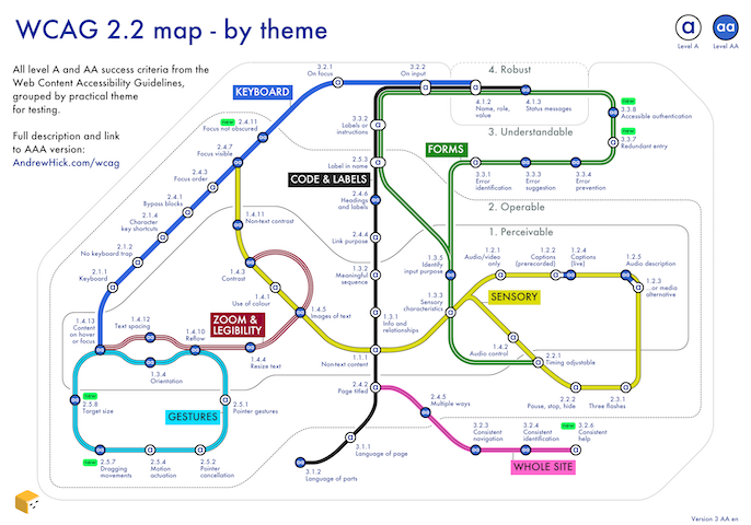
Select the image or see the WCAG map page for more detail. This diagram groups all the success criteria from the Web Content Accessibility Guidelines (WCAG) version 2.2 levels A and AA, by practical theme for testing.
WCAG for humans
(colourful stripes)
The Web Content Accessibility Guidelines (WCAG, version 2.2 AA) summarised on one page in 7 practical themes.
Read WCAG for humans.
Colour mosaic
A colour chart for digital art and design.

Select the image or see the colour page for more detail. This poster shows 262 colours inspired by art, nature, travel and culture. Most are established, some are new. They are roughly in rainbow order with grey in the middle.
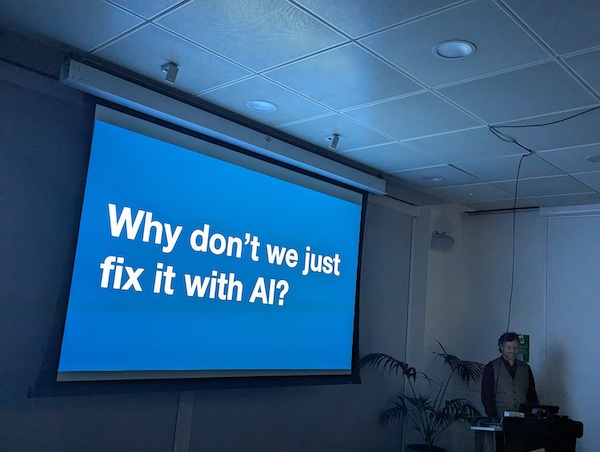
Service Design Bristol presentation
Presentation: Making services accessible, accessibly
For Service Design Bristol, January 2025. What good - and bad - accessibility look like, why it can't "just be fixed with AI", ways to build in accessibility from the start, and decoding the accessibility regulations. Photo: James Reece
All sections
Work
- Accessibility resources including a Web Content Accessibility Guidelines map ♿️
- Colour charts and contrast checker
- Design - web and graphic
- My CV
Creative
Mainly visual hobbies.
- Art - paintings, linocut, drawings and cross stitch
- Maps - mind and city maps
- Photos
- Games - Pandora, a pixelly cat game
- Puzzles - small, hand-drawn visual puzzles