Presentation: Accessibility doesn't have to be hard
A presentation for South West User Experience, October 2022.
Contents:
- Introduction
- Show of hands
- Accessibility doesn't have to be hard
- Two types of team
- Accessibility should be accessible
- 80:20 rule
- Accessibility myths
- What is accessibility?
- Listen to disabled people
- How to test
- Write it all up
- Shift left
- Keep it simple
- Keep it semantic
- Resources
- Who to follow
- A bit more about ARIA
Introduction
Slide: Andrew Hick: an, drew as in picture, hick rhymes with pick
I work in the accessibility monitoring team at the Government Digital Service in Bristol, love making websites work for everyone, and enjoy making things out of pens, pixels, code and string.
I also love retro video games and made one about my cat.
We monitor websites and mobile apps for the public sector accessibility regulations.
Show of hands
Spoken: Both of these statements are red flags - you’re fighting a losing battle if a stakeholder is looking for excuses not to make a site accessible.
Accessibility doesn't have to be hard
I’m going to try and convince you that accessibility doesn’t have to be hard.
Two types of team
Spoken: The first is the ‘why should we’ team - ‘why should we make it accessible?’
This is characterised by people who see accessibility as a barrier or red tape, people who don’t think accessibility is part of the minimum viable product (the clue is in the word viable), people who think they have no disabled users, deprioritise accessibility issues or move testing to the end. Even worse, they might think that accessibility issues can be fixed with a single line of code, as some overlay vendors claim.
Then there’s the second type.
Spoken: The other type is the ‘why wouldn’t we’ team - ‘why wouldn’t we make it accessible’?
Of course, accessibility is a human right. Of course, viable means accessible. Of course, we don’t want to exclude anyone. Of course, we test for accessibility throughout, from research through to deployment.
Spoken: But to make that easier…
Accessibility should be accessible
Spoken: Leaving accessibility to a mythical accessibility unicorn (if they even exist) is a good start but doesn’t educate the rest of the team at all. By ‘mythical unicorn’ this could refer to an internal or external accessibility specialist, quality assurance tester with lots of conflicting priorities, enthusiastic content designer or another role. Unfortunately many teams don’t even have anyone aware of accessibility.
Accessibility shouldn’t fall to one person - it should be everyone’s responsibility.
80:20 rule
Spoken: The 80:20 rule can be misinterpreted as if to say we shouldn't cater for all users. This is the opposite of what accessibility is about. So here's a clarification...
Spoken: I’m a big believer in the 80:20 rule - that 20% of the work delivers 80% of the benefit. If we can all look out for common accessibility issues with every user story, we’ll probably eliminate most accessibility issues.
Spoken: Accessibility depth is useful to answer tricky questions like whether you can use an aria-label on a <div> with no role. However, my job title is accessibility specialist, but I still have to look up things like that and it’s not always clear what the real-life impact is. (I’m lazy and tend not to memorise things that I can look up.)
We’ll get the best results if we’re all on the lookout for broader, simple things, like whether a site works with zoom, with a keyboard or with a screen reader. That’s the 20% of effort with the most benefit.
Accessibility myths
Spoken: According to Scope, one in five working age adults has a disability. And the Home Office have previously shared posters saying “We are all only temporarily not disabled”. Although the wording of this phrase might be controversial because there’s a risk it centres non-disabled people, it’s there to provoke a change in mindset that you might be helping your future self and those around you.
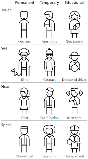
Spoken: This graphic from Microsoft Inclusive Design is often shared, but great at illustrating the different temporalities of disability. There are permanent, temporary and situational disabilities, with examples under touch, see, hear and speak categories. For example, having one arm is a permanent disability, having an arm injury is a temporary disability, and being a new parent holding a baby is a situational disability.
I don’t have a permanent disability, but I’ve recently had a baby and suddenly need to do a lot more things one-handed, and navigate around steps with a pushchair. Also, I have a mild colour vision deficiency to the point that I might miss some visual cues on websites.
And don't forget that:
Spoken: One estimate says that 80% of disabilities are not visible.
Spoken: I really recommend the article 'Accessibility drives aesthetics' by Alex Chen. They provide several examples of where making things accessible also makes them aesthetic.
Slide: 
Spoken: Ling’s Cars is often used as an example of an inaccessible site and it’s true that there is lots of moving and distracting stuff on there. I’ve still seen worse in terms of accessibility though - the biggest offenders seem to be Enterprise Resource Planning type things.
Slide: 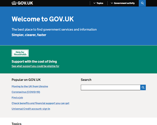
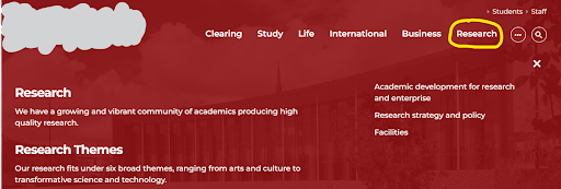
Spoken: And with GOV.UK - you can’t argue that’s not elegant, surely?
Spoken: Another misunderstanding of accessibility is...
Spoken: One thing I’ve heard is ‘it’s accessible because we’ve added ARIA labels’. These can help but it needs to be done well.
Spoken: Now we’re into real ‘there be dragons’ territory. It’s possible to use a plugin or overlay which adds functionality to a webpage.
Be very careful, the consensus across the accessibility community is overwhelmingly to avoid them. Particularly any which claim to fix all accessibility issues in a line of code - they can often make things worse.
It’s worth reading the Overlay Factsheet before looking at any overlay type solutions.
It's often tempting to think that...
One question we haven't yet answered is:
What is accessibility?
Spoken: Here are a few definitions of accessibility...
Spoken: - it’s really hard to argue with that statement.
Spoken: A counterexample to this is where people use the alt text in Twitter for in-jokes - that’s not the same experience. Another one is where captions have swear words censored out - as deaf/Deaf people won’t have the same experience.
Spoken: Is accessibility WCAG? We’ve just said that WCAG does not equal accessibility and that’s right.
Spoken: The double A standard, which most things aim for, misses out things like alternatives to digital channels, content being clear, or unique links. It is ambiguous in places, and doesn’t always define things well. It’s also very black and white, not distinguishing between big failures (like a lack of keyboard support) and small ones (like an ARIA attribute used on an element which shouldn’t support it). It’s far from perfect. But...
Spoken: However, it’s a good start for now. According to our testing (we released a report into our public sector website and app testing in 2021), only 2% of pages passed our simple tests. And this is for organisations that have been legally required to make their websites accessible since 2018.
Listen to disabled people
Spoken: I’m conscious that this might sound a bit ‘othering’ and I hope that there are disabled people in your teams. Disabled people’s insight trumps adherence to standards. I’ve had the pleasure of working with Marian Avery who recently tweeted this:
Slide: Things we’ve learnt when testing with disabled users
A carousel is still going to be distracting, even if it has a pause button.
Left-aligning text helps people who use high levels of zoom
(otherwise info might get missed).
Spoken: Most people read websites in the shape of a capital F and it’s important to anchor text to the left hand side of the screen, otherwise information might get missed.
Slide: It’s important to communicate the expanded/collapsed state of a menu.
How to test
Spoken: To summarise so far, to get the best insight from testing with disabled users, we should all be on the lookout for common issues and view accessibility as something that everyone should get involved with. So how do we actually do that?
Spoken: This test will probably give you the best indication of how much the site team has thought about accessibility.
This might look like quite a lot, but essentially it’s ‘can you interact with the website using the keyboard at different zoom levels?’ There are a couple of nuances like whether you can bypass menus or what constitutes a keyboard trap, but fundamentally, does it work?
Spoken: The next thing to do is to check if there’s anything on the page that relies on a sense, or interferes with the viewing of the page.
Spoken: Look out for intrusive things like flashing, auto-playing sound or time limits, or things that rely on good vision. Faint text, or using colour alone to convey meaning, are a no-no.
We’re not saying you can’t use colour at all (although you might think that from looking at gov.uk). We’re just saying that colour shouldn’t be the only means of conveying information.
And sound and vision can be a useful addition to a site, but it shouldn’t be the only way to convey information, and definitely shouldn’t flash, or play without the option of stopping it.
Spoken: We currently use the Axe Chrome extension although others are available, like WAVE and Google Lighthouse (although I think this also relies on Axe). This runs an automated check on a website for things like missing form labels and alternative text, incorrect usage of ARIA and some colour contrast issues.
While you can count issues in different ways, we believe Axe finds around 30-40% of accessibility issues. So it’s never a full test, but the things it does pick up would usually be harder to find yourself.
Slide: 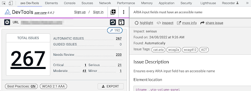
Spoken: This is what a site with lots of issues might look like - in this case, there are 267 issues such as ‘ARIA input fields must have an accessible name’.
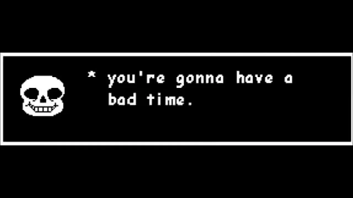
When I see this I think of the meme ‘you’re gonna have a bad time’. This is the otherwise loveable Sans from the game Undertale.
Slide: 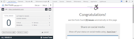

Spoken: And this is what Axe looks like where there are no automatically-detectable issues.
Any excuse to add a nyan cat in to celebrate.
Slide: 4. Use a screen reader
Check that things are what they look like, have appropriate labels, and dynamic changes are communicated.
We use NVDA on Windows because it provides the most ‘raw’ experience and is commonly used.
It doesn’t try to autocorrect bad markup too much. It’s also free (although donations are always welcomed).
VoiceOver on Mac works well too but is less widely used.
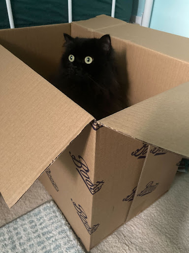
Spoken: Here we have a picture of a cat in a box. What alternative text would you use here?
I’ve gone with: “Fluffy black cat with an intense expression sitting in a cardboard box labelled 'Boots'.” I did consider “Puss in Boots” which would be convenient, but that would mean that people reading the alt text wouldn’t be getting the same information as people who can see the image.
This covers:
Spoken: Here are the last bits. I’ve said to check them ‘if time’ because these fall more under the 80% of effort that only delivers 20% of the benefit.
Write it all up
Spoken: Once we’ve tested, we need to communicate the results in an accessible way.
Currently we send attached reports, but we’re close to being able to send HTML reports published on our platform.
Here’s what we include in our reports:
Spoken: We’re currently trialling two types of report: ordering issues by WCAG or ordering them by page. We’re doing some research into it, but if anyone has any insight over what works best then please let me know.
Slide: By WCAG:
By page:
We’ve tested our site and written a nice report.
But rather than finding issues, wouldn’t it be nice to prevent them?
Spoken: As well as getting everyone in the team bought in with accessibility, what else can we do?
A common term in testing is to...
Shift left
Spoken: While the amount varies based on the kind of pipeline you use, design defects are always cheaper to fix than live defects.
Spoken: So why wouldn’t we build accessibility into our acceptance criteria, tests and releases? If it’s not accessible, it’s not done, or to use the wording from the Royal National Institute for Blind People’s wording, ‘not accessible, not acceptable’.
Keep it simple
This is more likely to prevent defects.
Slide: Just because you can, doesn’t mean you should.
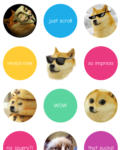
Spoken: There’s a component we see a lot called wow.js and I love the website - who doesn’t love shiba inu dogs? It makes things animate themselves into view as you scroll down the page.
However, when we’ve tested it using a keyboard and screen reader, we’ve noticed that items don’t appear in the DOM (on the page) until you scroll, meaning that some users will miss some content. I’m holding out hope that they can find an accessible way to do it though, just so I can keep going back to their website. Next...
Keep it semantic
Spoken: Semantic HTML means using tags that have the correct meaning for the thing you’re trying to achieve. If you’re building your own custom components then just a reminder that there is a thing called ARIA that you can use to give things certain accessibility properties. But only use it if you need to. I’ll talk a bit more about ARIA at the end if we have time.
Resources
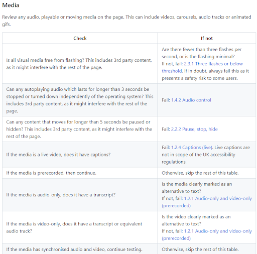
Slide: Accessibility testing guide
We’ve worked on the guide for the past couple of years, led by Anika Henke in GDS.
It covers how to test each WCAG level A and AA criteria in depth. We use it all the time.
WCAG decision tree
However there are about 50 level AA criteria - where do you start?
I made a decision tree to help you work out which criteria something might fail on.
These resources are linked to from: AndrewHick.com/accessibility
I also recommend Google's free Web Accessibility course, hosted by Udacity.
Who to follow
Spoken: Finally I’m going to suggest some people to follow.
Don’t just listen to me, listen to more people who are passionate about accessibility and inclusion. I've used names and handles as used on everyone's Twitter profile: